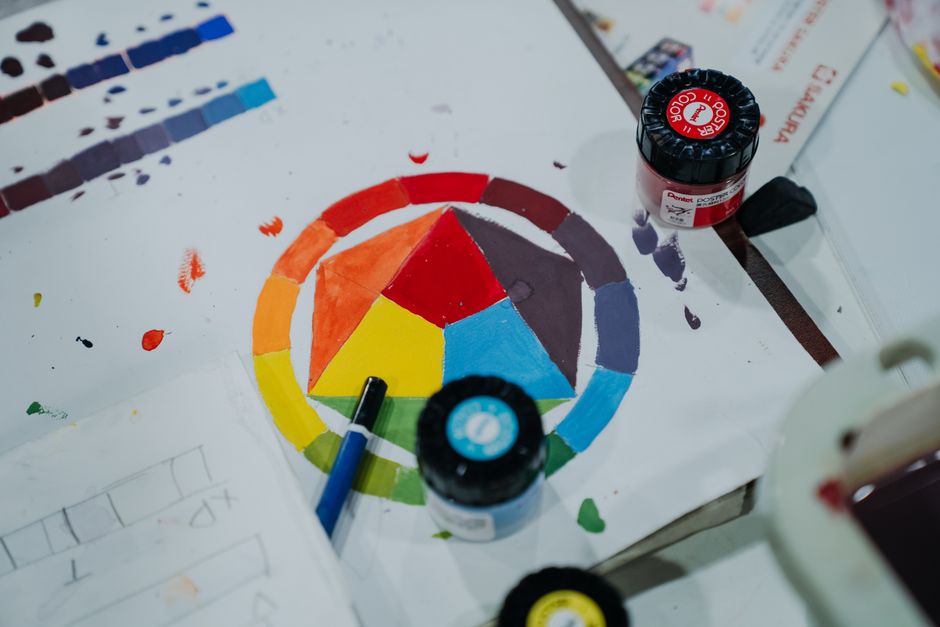
Understanding the Color Wheel: A Beginner’s Guide to Mixing Paints
The color wheel is a foundational tool for anyone working with paint, whether in traditional fine art, illustration, or decorative applications. It provides a visual representation of how colors relate to one another, offering a structured way to approach mixing and harmonizing hues. For beginners, understanding the arrangement of colors on the wheel can open up a more intentional and informed method of selecting and blending paints.
This guide explores the basic structure of the color wheel, the relationships between different color groups, and practical exercises that can help build confidence in mixing. Rather than prescribing specific outcomes, it focuses on the principles that underlie color interaction. By observing these principles, painters can develop their own approaches to achieving desired color effects.
Artists often find that regular experimentation with the color wheel leads to a deeper appreciation of how subtle shifts in hue, value, and saturation influence a composition. The following sections outline key concepts and activities that support such exploration.
The Basics of the Color Wheel
The color wheel is typically organized into three categories: primary, secondary, and tertiary colors. Primary colors—red, blue, and yellow—cannot be created by mixing other colors and serve as the foundation for all other hues. When two primary colors are combined, they produce a secondary color: red and yellow yield orange, blue and yellow yield green, and red and blue yield violet.
Tertiary colors arise from mixing a primary with an adjacent secondary color. Examples include red-orange, yellow-green, and blue-violet. These intermediate hues fill the gaps between the primary and secondary positions on the wheel, creating a smooth transition from one color to the next. The traditional 12-color wheel includes three primaries, three secondaries, and six tertiaries, offering a comprehensive spectrum for mixing reference.
Understanding the arrangement helps in predicting what will happen when two colors are combined. For instance, mixing colors that are close together on the wheel tends to produce vibrant, harmonious results, while mixing colors from opposite sides can yield more neutral or muted tones. This spatial relationship is central to many color mixing strategies.
Complementary Colors and Their Role
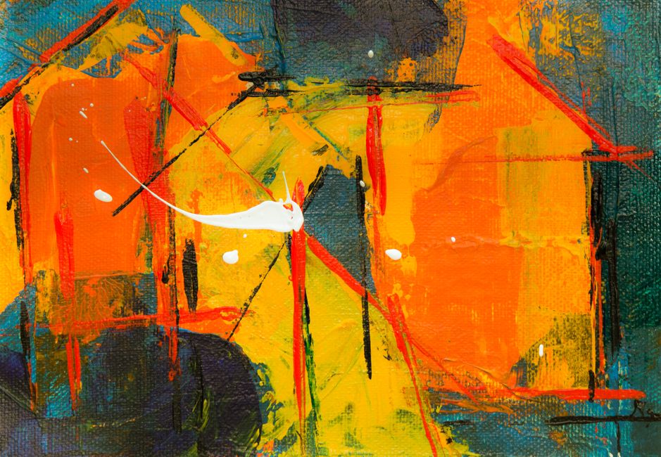
Complementary colors are pairs that sit directly opposite each other on the color wheel. The most common pairs are red and green, blue and orange, and yellow and violet. When placed side by side, complementary colors create strong contrast and visual vibration. When mixed together in varying proportions, they tend to neutralize each other, producing shades of gray, brown, or muted tones.
This neutralizing property is useful for adjusting the intensity of a color without relying on black or white. For example, adding a small amount of green to a red mixture can reduce its brightness, resulting in a more subdued red. The exact outcome depends on the specific pigments used and the ratios applied, so experimentation is encouraged.
In painting, complementary colors are also employed to create depth and shadow. A painter might add a touch of a color’s complement to darken an area while maintaining color harmony, rather than simply using black. This technique can produce more natural-looking shadows that retain color vibrancy. Because the effect varies with different paint formulations, testing small samples beforehand is a common practice among artists.
Practical Mixing Exercises
One approach to becoming familiar with the color wheel is to create a personal color mixing chart. Using a limited palette of primary colors, a painter can systematically mix combinations to produce each secondary and tertiary hue. This exercise helps in observing how different ratios of paints influence the resulting color. For instance, mixing equal parts of red and blue yields violet, but adjusting the proportions toward red produces red-violet, while leaning toward blue gives blue-violet.
Another exercise involves creating a monochromatic series by adding varying amounts of a complement to a single hue. Starting with a pure color, one can gradually introduce small increments of its opposite, noting how the color shifts toward neutrality. This practice illustrates the concept of color temperature and saturation reduction without the use of black.
A third exercise focuses on color harmony: selecting two or three colors that are either analogous (adjacent on the wheel) or complementary and painting a simple composition using only those colors. This limitation encourages observation of how colors interact in a controlled context. The results will vary based on the chosen hues and the painter’s handling of the paints, but the process itself builds a practical understanding of color relationships.
Exploring Color Temperature
Color temperature refers to the perceived warmth or coolness of a hue. Reds, oranges, and yellows are generally considered warm, while blues, greens, and violets are cool. However, within each color family, variations exist—for example, a yellow with a greenish tint may appear cooler than a yellow with an orange tint.
On the color wheel, warm and cool colors tend to occupy separate halves, though the division is not rigid. Understanding temperature can help in creating spatial depth, as warm colors often appear to advance while cool colors recede. When mixing paints, adding a small amount of warm color to a cool mixture can shift its temperature slightly, and vice versa. The direction of the shift depends on the specific pigments, so artists frequently test mixtures on a palette before applying them.
In practical mixing, an awareness of temperature allows for more nuanced adjustments. For instance, a painter might warm up a shadow by adding a touch of violet instead of a pure cool blue, depending on the desired effect. Because every color mixture is influenced by the inherent temperature of each pigment, no two blends behave identically.
Additional Considerations for Mixing
Beyond the basic color wheel, there are other concepts that influence paint mixing. Value refers to the lightness or darkness of a color, and it can be adjusted by adding white (creating tints) or black (creating shades). Adding white to a hue reduces its saturation, producing pastel-like colors. Adding black can muddy the hue if used excessively, so many artists prefer to darken colors using complements or darker versions of the same hue.
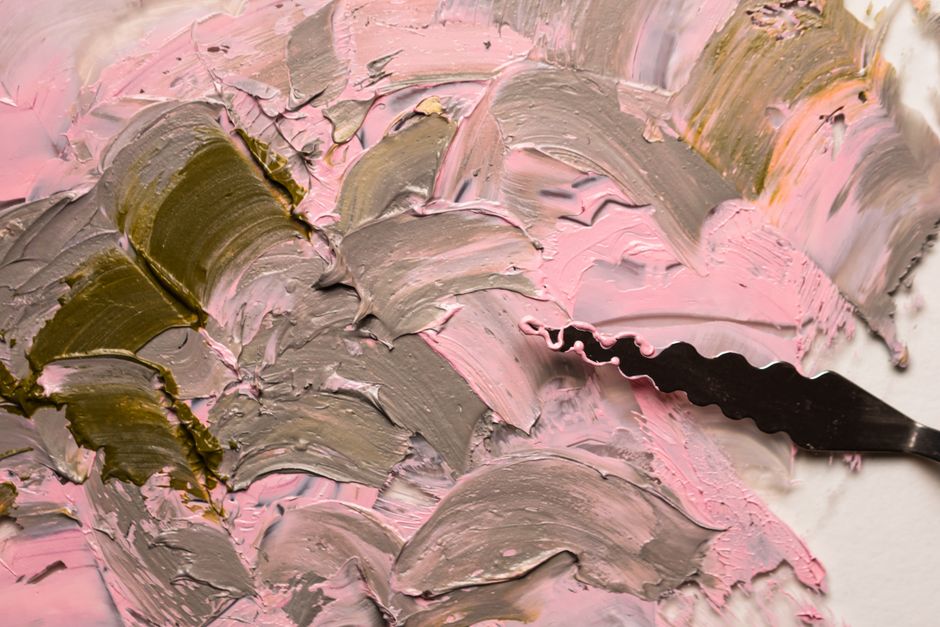
Neutrals—grays, browns, and earth tones—can be created by mixing complementary colors in various proportions. These muted colors play an important role in balancing more intense hues within a composition. A common method is to combine all three primary colors in unequal amounts, then adjust with white or a small amount of the dominant hue to fine-tune the result.
Each paint brand and pigment type behaves differently, so the best way to understand a particular palette is through direct experimentation. Keeping a journal of mixing ratios and observations can help build a personal reference that is far more useful than generic formulas. Over time, this practice cultivates an intuitive sense for color that goes beyond memorizing the wheel.
Observing how colors interact in real time, rather than relying on fixed rules, remains one of the most effective learning methods for painters at any stage.